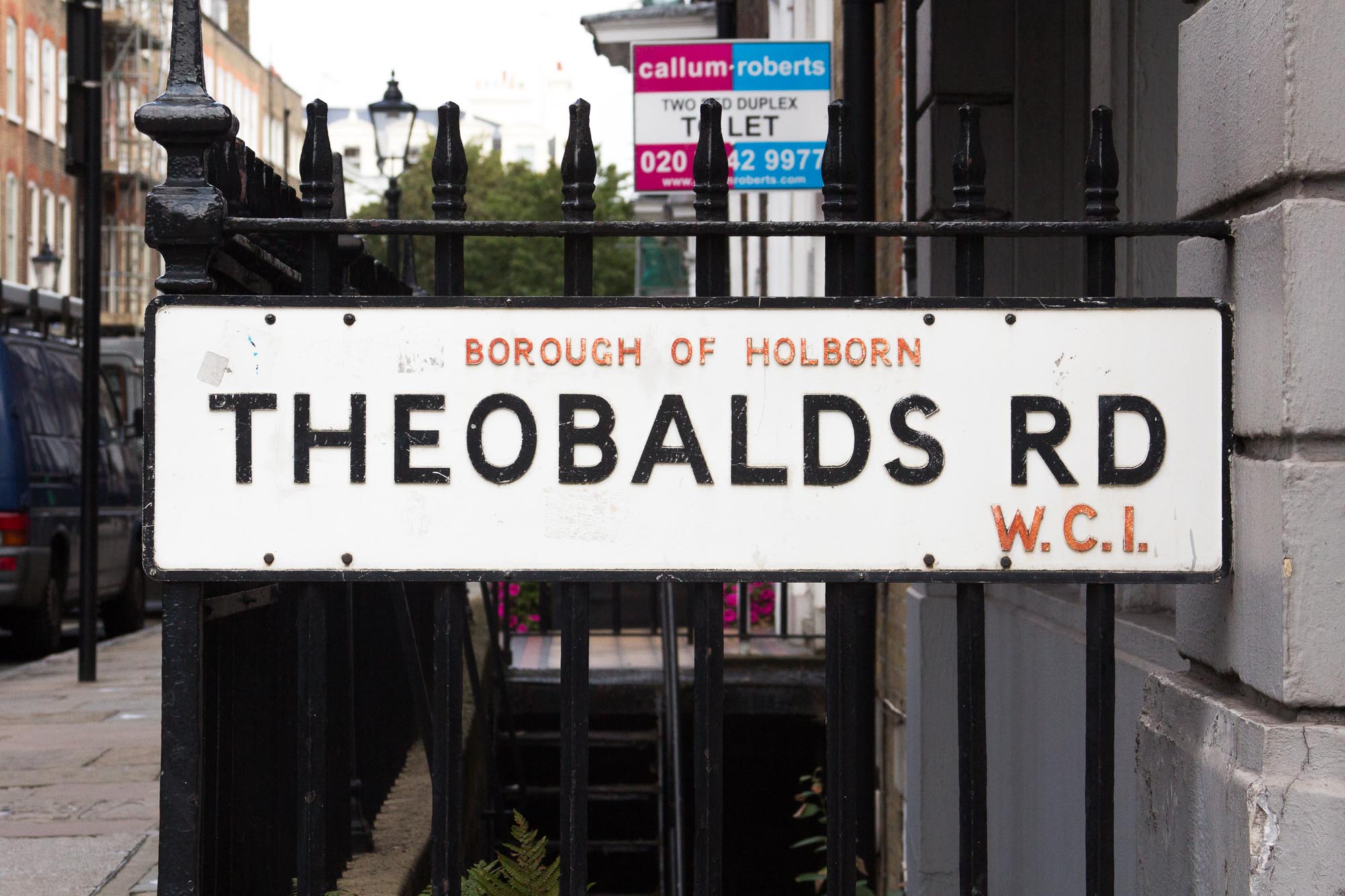
London street name fonts
In the process of researching my book, London Street Signs, I came across quite a lot of examples of fonts either used on, or inspired by, London’s street nameplates (the signs that tell us the name of each road). I thought it might be useful and interesting to put a list of them together here.
First though, it might be helpful to get a sense of what you can and can’t do when it comes to designing street signs.
NATIONAL LEGISLATION
Legislation on what lettering can be used on London’s street signs can be really quite hard to track down. Fortunately, a wonderful report from 2003, Where am I? Street name signs in London, by the London Transport Users Committee (also known as London Travelwatch), clarifies the legislation and guidance available for local councils.
Nationally, the Town Improvement Clauses Act of 1847 first set out the need for streets to have visible names on them (in section 64 of the Act), although it doesn’t get into the specifics of design.
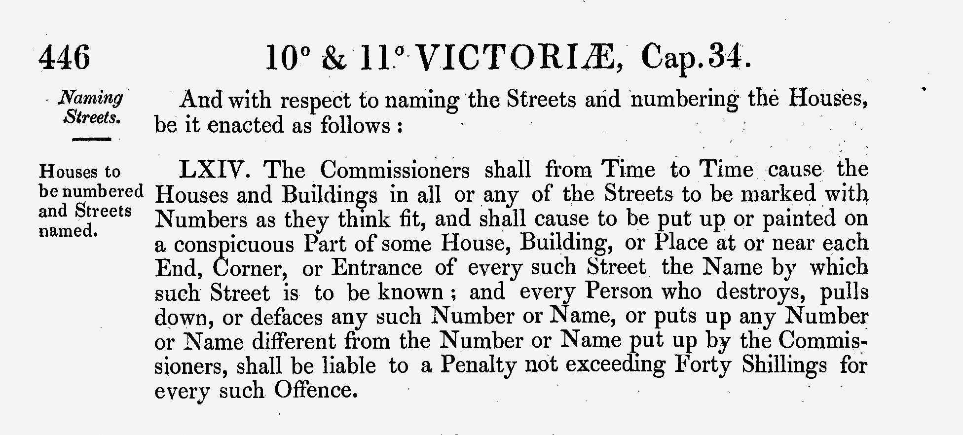
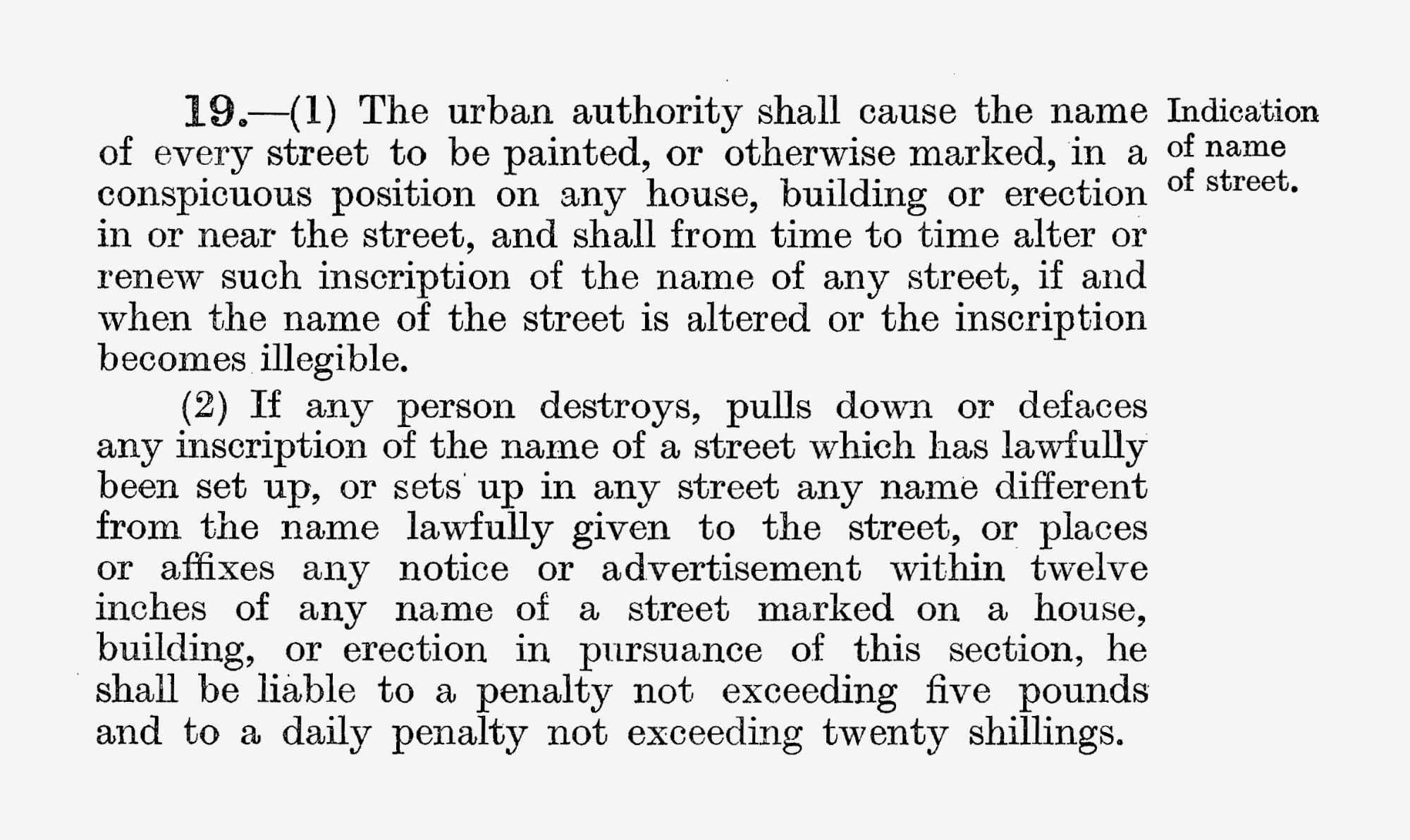
The Public Health Act of 1875 incorporated that legislation, and the Public Health Act of 1925 clarified it:
This national legislation is now the responsibility of the improbably named Department for Levelling Up, Housing & Communities.
LONDON LEGISLATION
London has separate legislation, in the form of the London Building Acts (Amendment) Act 1939 (Part I. Section 2. Part II. Naming and numbering of streets, buildings &c.) in which the London County Council committed to:
“make regulations with respect to the setting up of the names of streets ways places rows of houses or blocks of buildings and matters in connection therewith without prejudice to the generality of the foregoing provision such regulations may provide for the name to be placed on part of a building or structure and in such position thereon as may be prescribed by the regulations.”
They got around to this in 1952, with the London County Council Street Naming regulations. Finding a copy of those is… problematic. As part of their investigations, the authors of the Where Am I? report, mentioned above, contacted all 32 of the London councils to ask them which legislation they were following. Of the 13 that replied, only some were aware of any guidance, and only one was using the 1952 regulations.
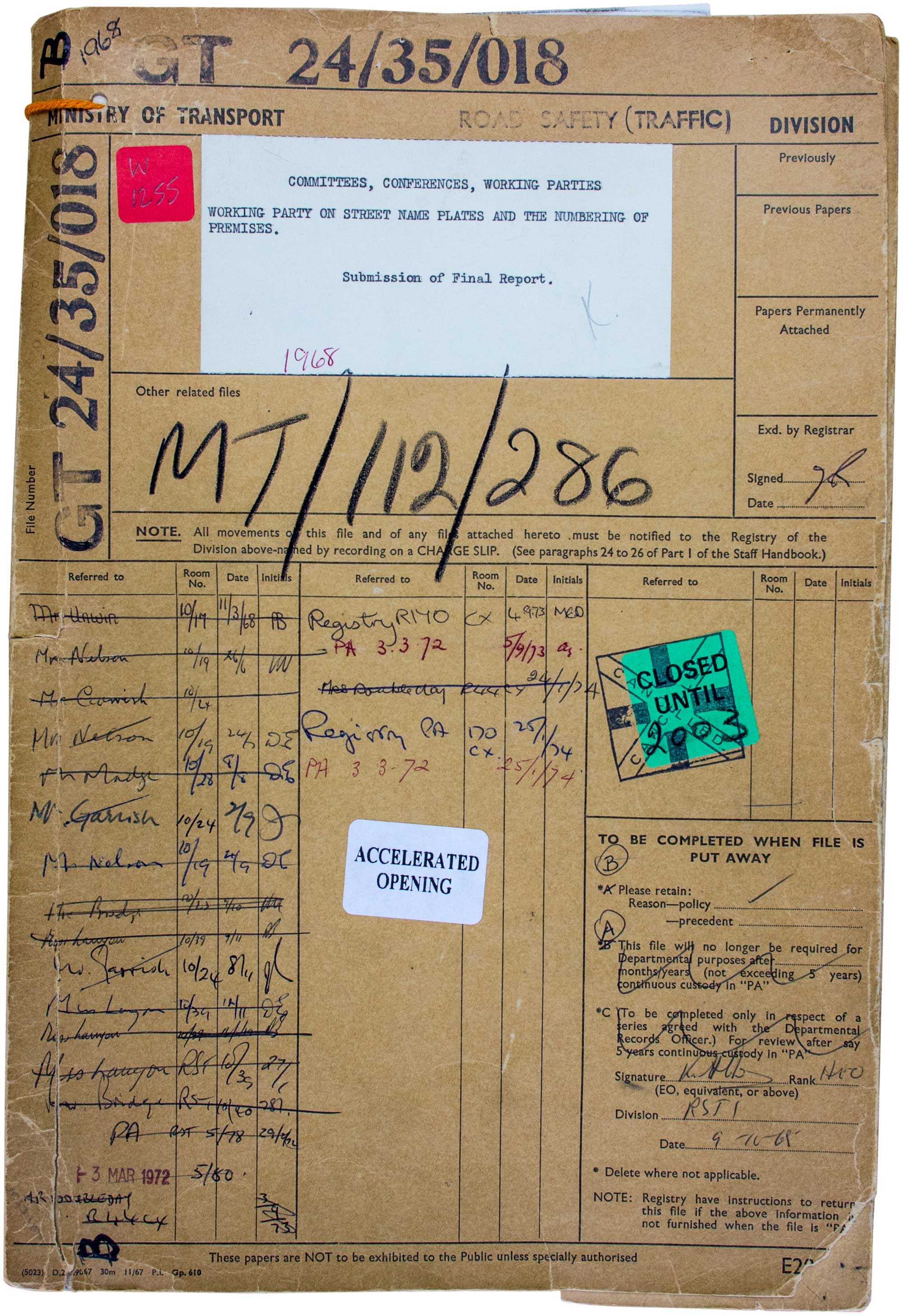
I had to go to the National Archives in Kew to find an original copy, in file MT/112/286, as an appendix to the Report of the Working Party on Street Name Plates and the Numbering of Premises, from 1968.
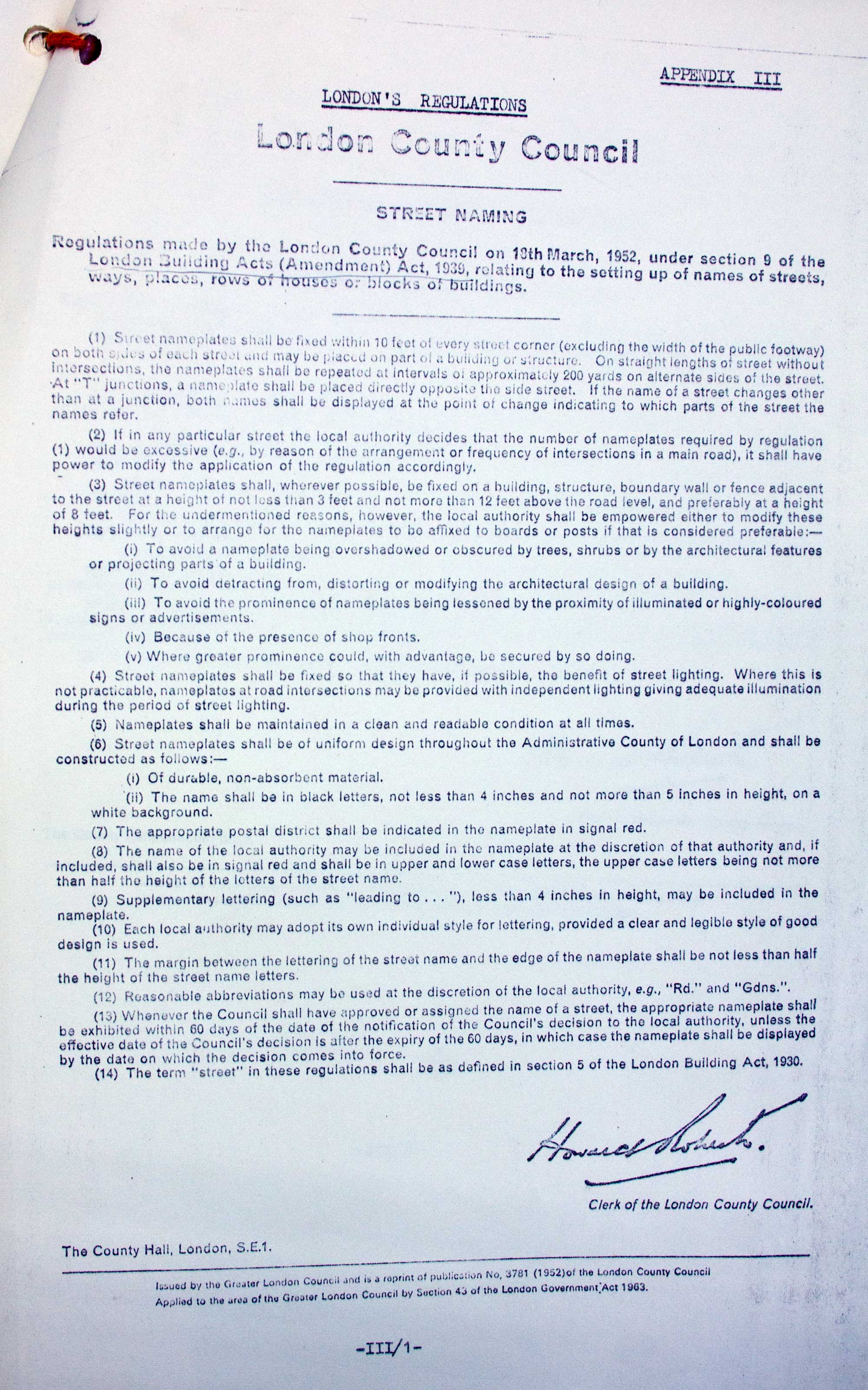
The London Transport Users Committee were also good enough to write up these regulations in the appendices to their report. From a design point of view, the relevant bits are:
(6) Street nameplates shall be of uniform design throughout the Administrative County of London and shall be constructed as follows:-
(i) Of durable, non-absorbent material.
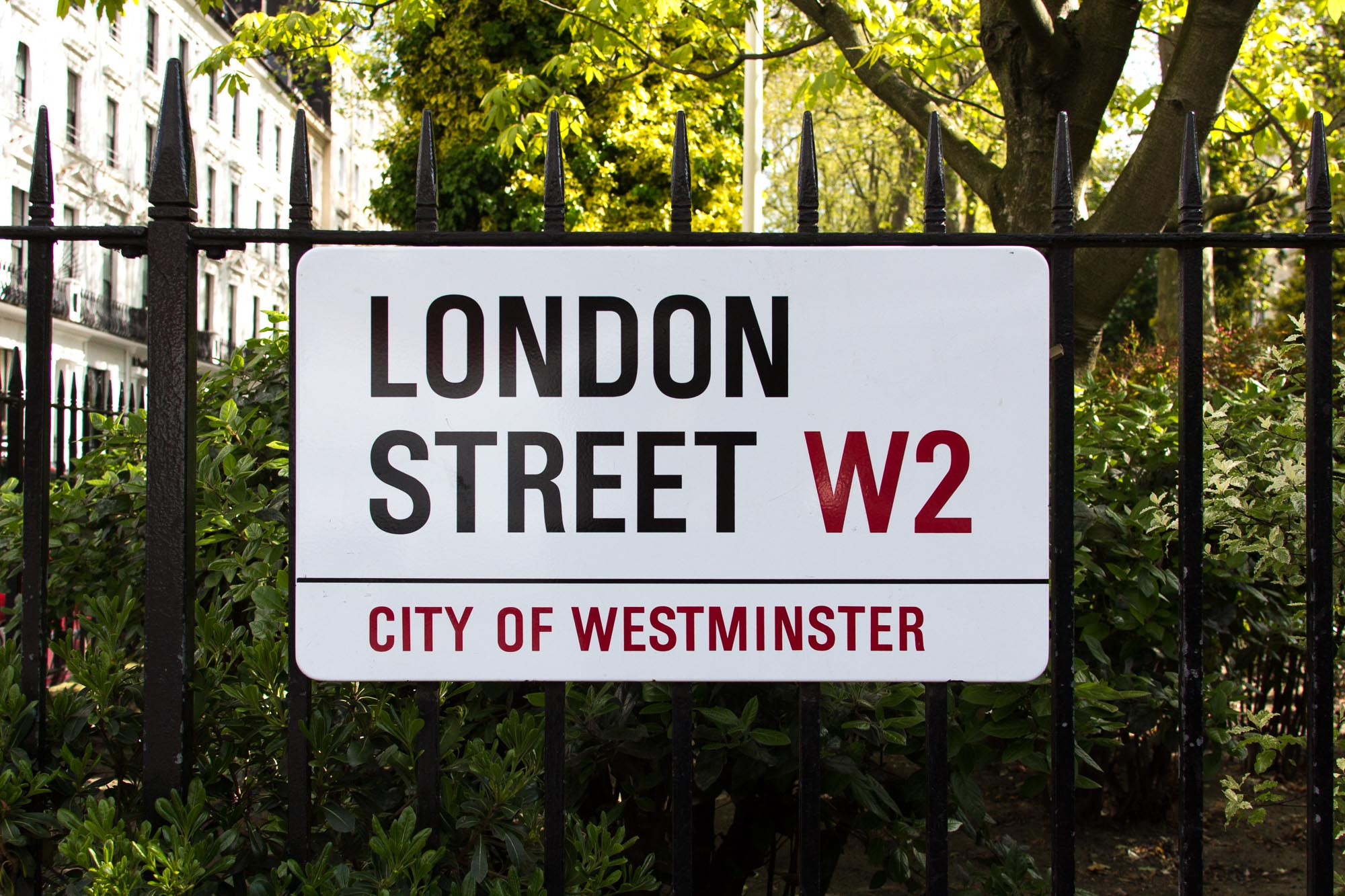
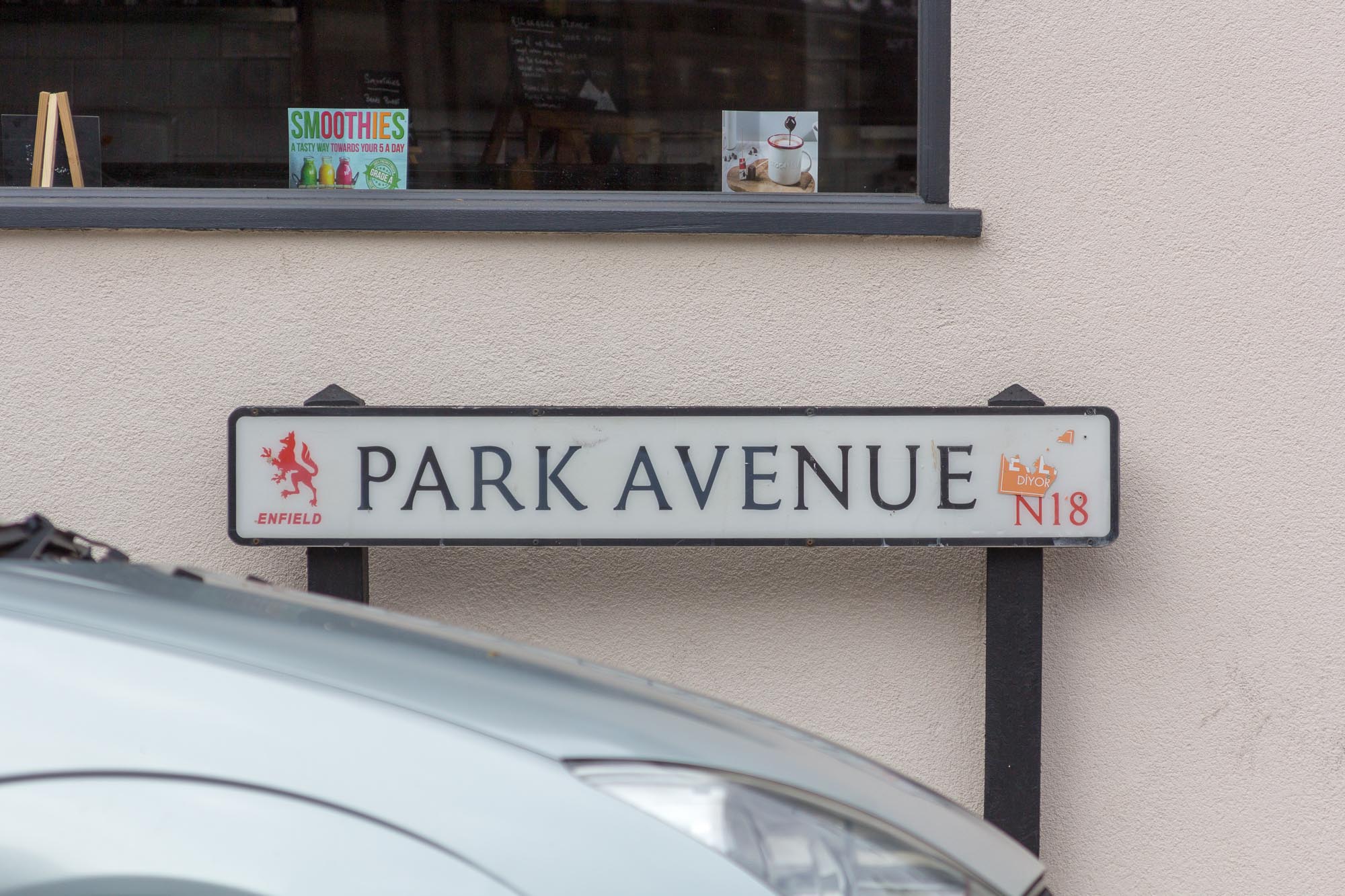
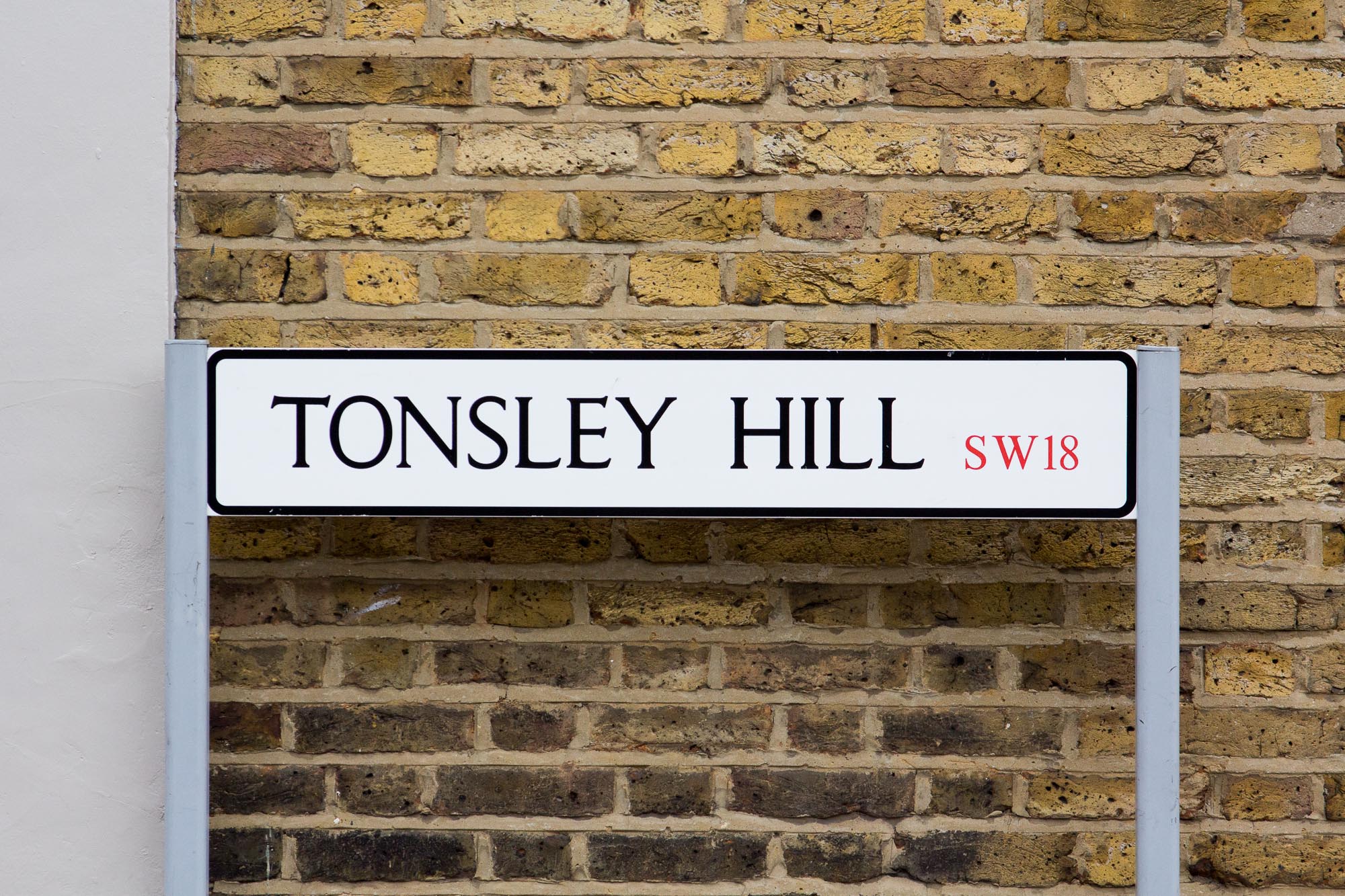
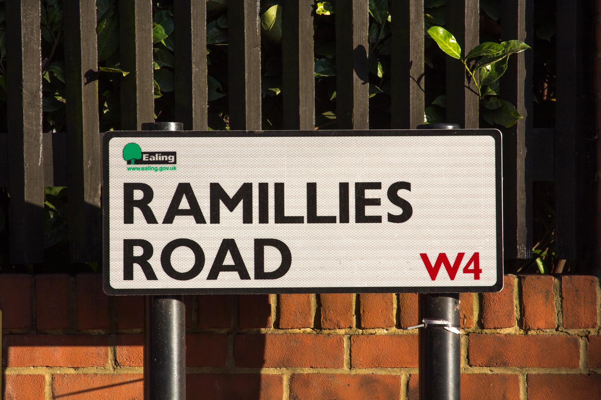
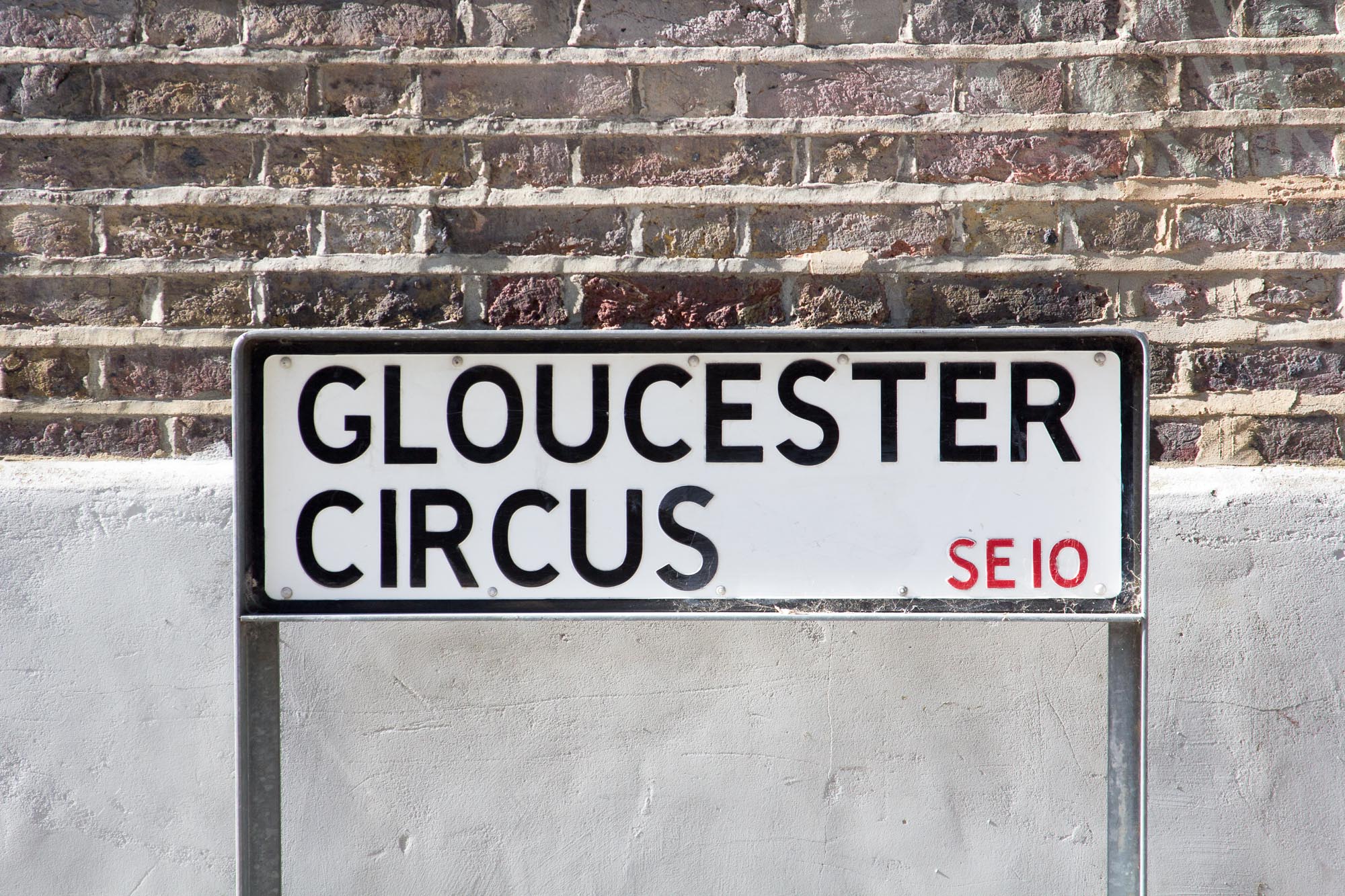
(ii) The name shall be in black letters, not less than 4 inches [102mm] and not more than 5 inches [127mm] in height, on a white background.(7) The appropriate postal district shall be indicated in the nameplate in signal red.
(8) The name of the local authority may be included in the nameplate at the discretion of that authority and, if included, shall also be in signal red and shall be in upper and lower case letters, the upper case letters being not more than half the height of the letters of the street name.
(9) Supplementary lettering (such as “leading to…”), less than 4 inches [10.2cm] in height, may be included in the nameplate.
(10) Each local authority may adopt its own individual style for lettering, provided a clear and legible style of good design is used.
(11) The margin between the lettering of the street name and the edge of the nameplate shall be not less than half the height of the street name letters.
(12) Reasonable abbreviations may be used at the discretion of the local authority, e.g., “Rd” and “Gdns”.
NATIONAL GUIDANCE
Alongside these regulations (legally enforceable), there is also guidance (not so much) from the Department for Transport, in the form of Circular Roads 3/93, which dates from 1993 (when it was the Department of Transport), updating similar guidance from 1977, 1972, 1963 and 1952 (dating back to the days of the Ministry of Transport).
Unfortunately, it’s now quite hard to find that too. It used to be hosted on the gov.uk website, but isn’t anymore. (I’ve uploaded a copy it here though: Circular Roads 3/93.)
Here are the relevant bits from it about the design of nameplates:
5. The illustration of particular designs in Appendix D is not intended to preclude the use of others which might be more suitable for a particular locality, but the authorities are strongly recommended to adopt approximately the same ratio of legend to background and to avoid unduly thin lettering in order to ensure legibility. Good colour contrast is also important and combinations which are likely to be a particular problem for those who are colour blind should be avoided. It is not suggested that existing plates of character and distinction should not be replaced. The aim should be to promote a good standard of design. This can be achieved by following the criteria set out in Appendix B.
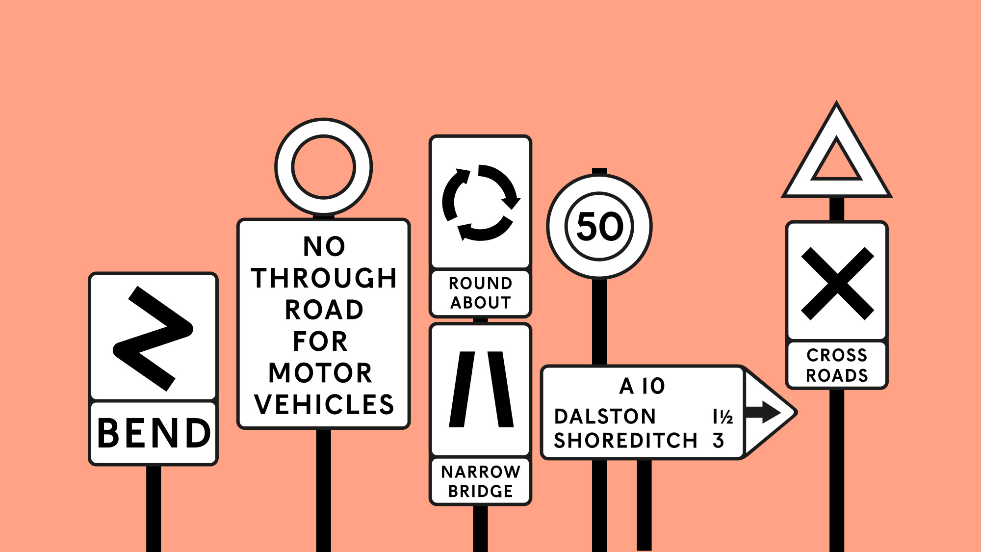
Appendix B: Recommendations for the design of street name plates
1. Because street name plates are commonly viewed from an angle it is important that wide well-spaced lettering should be used.
2. Capital lettering should be used to avoid confusion with traffic signs, which generally employ lower case lettering.
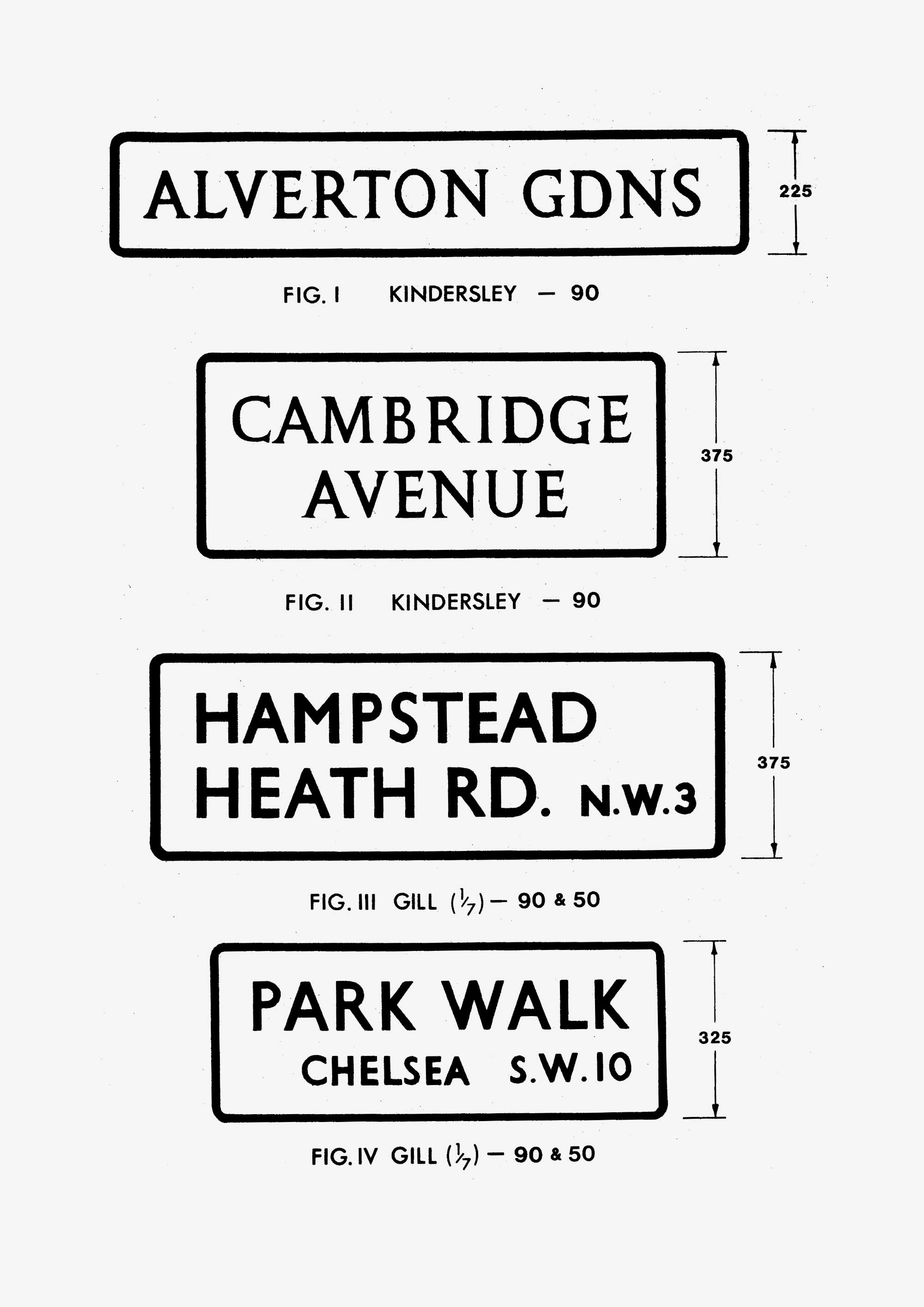
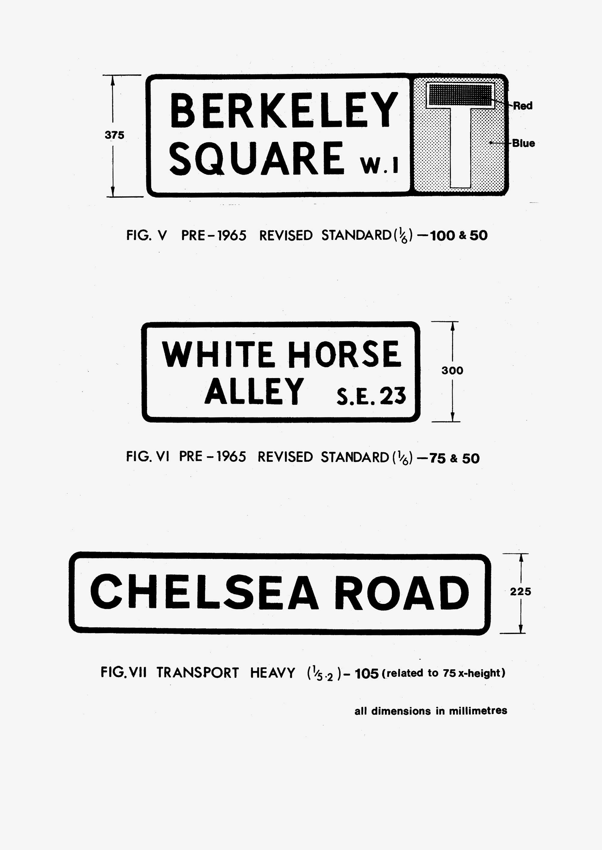
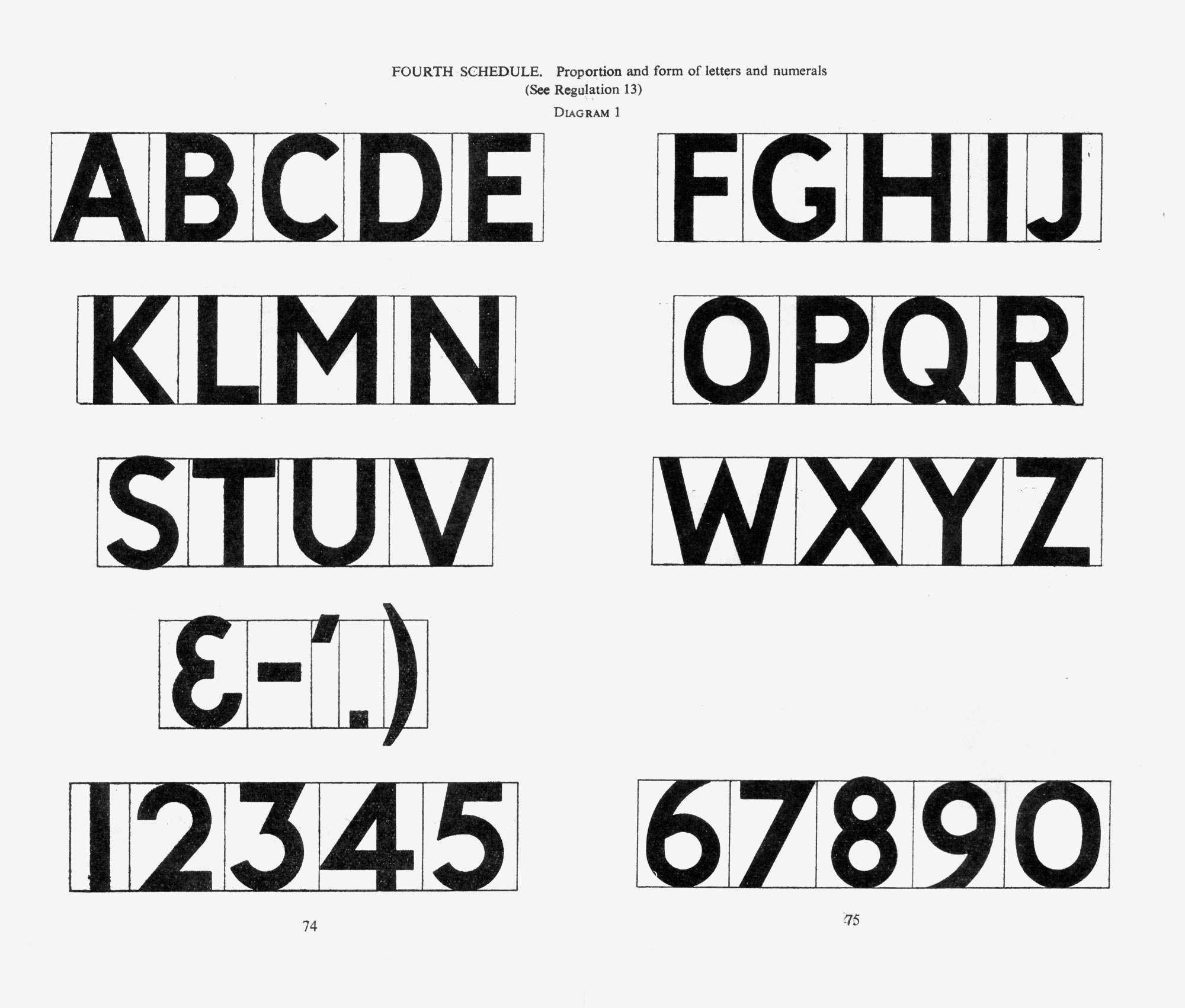
3. Figures ( i ) – ( vi ) illustrate suggested alphabets and designs. It should be noted that the many serif alphabets do not perform well when used on reflectorised backgrounds. Authorities are recommended to employ “sans serif” lettering on reflectorised name plates. Figures ( iii ) and ( iv ) employ a “sans serif” Gill letter. Figure ( v ) – ( vi ) use the pre 1965 Revised Standard Transport Alphabet. Figure ( vii ) shows the Transport Heavy Alphabet which is in current use for black legends on traffic signs. The relationship of the stroke thickness to letter height is shown in brackets. (It should not be more than 1 : 7 and not less than 1 : 4, to ensure adequate legibility). Figure ( v) illustrates a street name plate with a “No Though Road” sign (diagram 816.1) in Traffic Signs Regulations General Directions 1981 (same number in the 1994 TSRGD). This sign may be used with any street name plate to indicate a no through road to vehicular traffic.
4. A 100mm actual capital letter height of lettering is the recommended standard for both the Standard Transport and Transport Heavy Alphabets. With other alphabets with broader letter forms, 90mm may be used to reduce the length of the plate. Where fixing space is very restricted the design shown in Figure ( vi ) with either the Standard Transport or Transport Heavy Alphabets at 75mm capital letter height is preferable to using a 100mm alphabet with compressed letters and spacing. A 150mm letter height may be more appropriate on fast main roads.
5. Normally street name plates should have black lettering on a white background with a black border, as this gives the best contrast. Where coloured legends or backgrounds are used, a contrast ratio of at least 7 : 1 is required. The use of colour combinations with low contrast, for example bronze or brown lettering on green backgrounds, will result in poor legibility, especially under low pressure sodium street lighting. The white background should be reflectorised wherever plates are likely to be viewed from vehicle headlamps.
6. Only well known abbreviations should be used e.g. Ave., Cres., St., etc.
7. When streets have been re-named, the old name crossed out but clearly legible should remain for at least 1-2 years and then removed.
8. Only durable materials should be used for the construction of name plates and they should be maintained in a clean condition. Where a name plate is mounted on a specially provide post care should be taken to ensure that the appearance of the post and the back of the plate are as pleasing and as unobtrusive as possible. Aircraft grey No. 693 to BS 381c has been found an unobtrusive colour in most environments when erecting traffic signs and can be applied to street name posts. Black may also be used if preferred.
9. Area colour coding by a background colour on the street name plate is not recommended. There is a loss of good contrast with many colour combinations. A coloured border may be a suitable alternative. Good contrast (a ratio of at least 7 : 1) is necessary if this is to be effective.
10. The chief aim of letter spacing is to give good legibility having regard to the letter form used. Spacing should be sufficient to prevent letters having a jumbled appearance when viewed from an oblique angle. The apparent area between successive letters should be as uniform as possible and this is affected by the shape of individual letters. Vertical strokes found in B, D, E, etc are those which need to be furthest apart; curves in B, C, D, G, etc permit a slight decrease in spacing; right angled letters E, F, L, etc and slopping ones, A, K, V, etc can be closer still; some combinations such as LT, LY and VA can almost overlap.
11. The minimum spacing between words should be some 40% - 50% of the letter height, dependent on the form of the terminal letters. The end spaces to the border should not be less than would apply if the border were the vertical stroke of an adjacent word, except that some reduction in end spaces may be satisfactory if the line consists of a single word or is the longest line of several. Top and bottom borders should not be less than 50% of the letter height, and spacing between the lines not less than 40% of the letter height.
12. If district names are included on the name plate they should be shown in a smaller or reduced height of lettering. Figure ( iv ) gives an example.
So it’s just guidance, but it’s great to see thought given to colour contrast, word and letter spacing, appropriateness of lettering for materials, and size of lettering.
And here are the designs from Appendix D, to which it refers:
So, if you’re thinking of making a new street nameplate for a London council, you have some national legislation from 1925, some very hard to find London specific legislation from 1952, and some equally hard to find general guidance from 1993 (itself based on guidance from 1952). It doesn’t bode well for any new signage. It would be fantastic to see the guidance updated.
But let’s say you did find all the bits above somewhere (or hey, maybe you just read this post!), where would you go to find the various alphabets mentioned, but in a digital form?
So, we’ve got: Kindersley, Gill, Revised Standard, and Transport Heavy. Let’s look at each in turn.
KINDERSLEY

Kindersley is probably the most frequently used lettering on street nameplates nationally. The Kindersley alphabet was designed in the 1950s by letter cutter David Kindersley, specifically for street nameplates (it has a rather interesting genesis, you can read all about it in the book).
Oddly, the example of the Kindersley alphabet shown in Circular Roads 3/93 actually looks like a strange hybrid with his 1961 typeface, Octavian, designed in collaboration with Will Carter, as a fine book face.
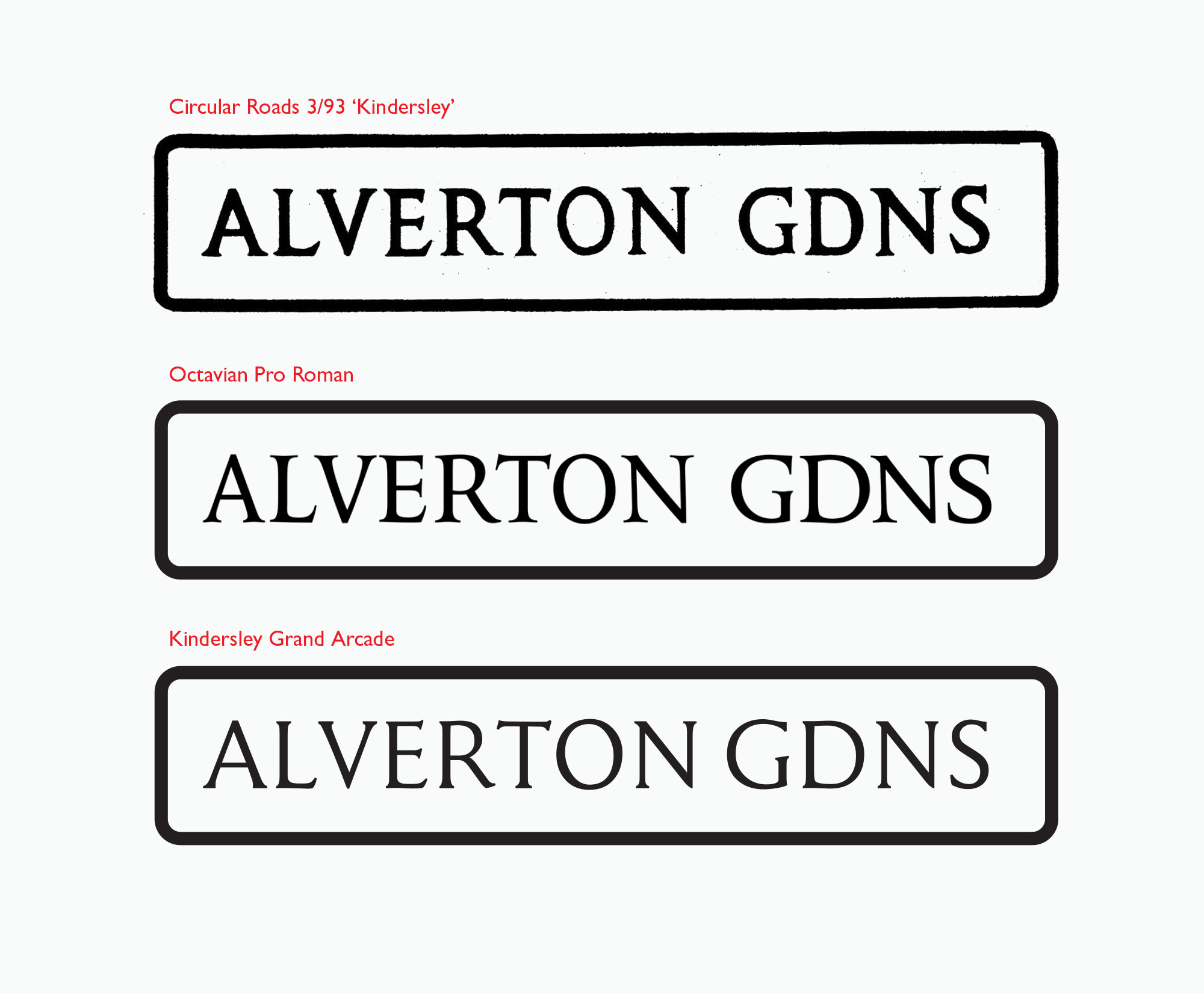
There are many different physical versions of the Kindersley alphabet out there in the world – many of them of poor quality. Fortunately, Kindersley’s widow, Lida Lopes Cardozo Kindersley (a fantastic letter cutter in her own right), together with type designer Eiichi Kono, created an updated digital version of the Kindersley alphabet, known as Kindersley Street or Kindersley Grand Arcade, and made it available for free.

There’s also a font inspired by Kindersley, called Streets of London, designed by the Lazydogs typefoundry.
GILL
Gill Sans is as quintessentially English as a Sunday Roast, Fish ’n’ Chips, or nattering about the weather. Eric Gill designed the typeface in 1928, partly basing it on Edward Johnston’s lettering for the London Underground, as well as on some fascia lettering he’d done for the Douglas Cleverdon bookshop in Bristol.
There are several digital versions available, the most recent of which is Gill Sans Nova, released in 2015, featuring multiple weights and alternate characters. Gill himself had troubling aspects to his life, and questions about the distinction between him and his work are likely to rumble on and on.
Gill Sans Nova is also available on Adobe Fonts.
REVISED STANDARD
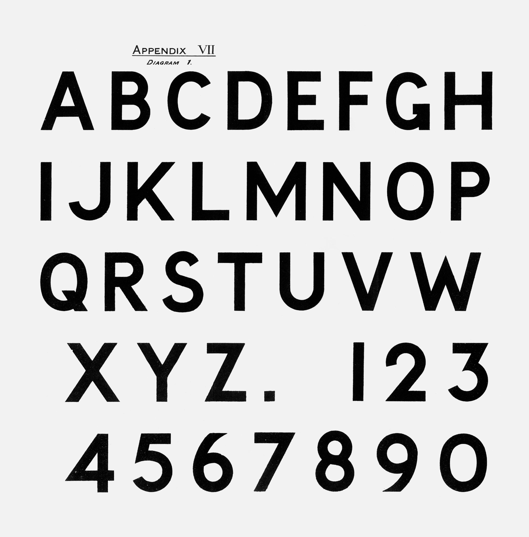
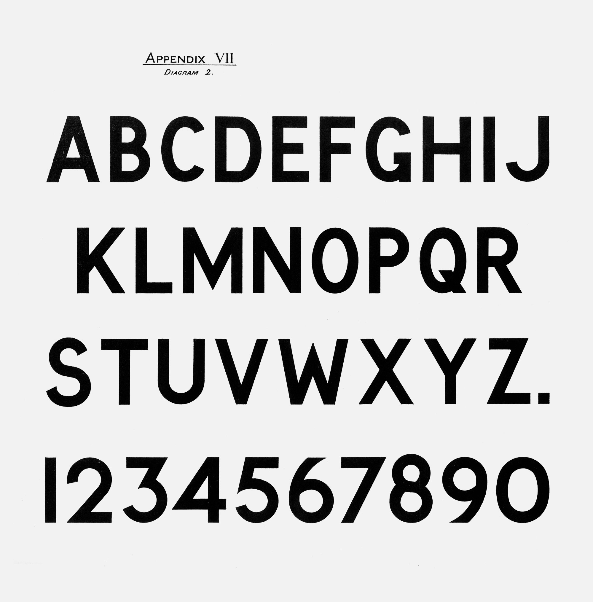
The Ministry of Transport released two versions of an alphabet for road signs in 1933 in its Report of the Departmental Committee on Traffic Signs – the Standard alphabet (Diagram 1., below), and the Compressed alphabet (Diagram 2., below).
The Standard alphabet was revised by David Kindersley in the early 1950s, and it is this that is still featured in the guidance in Circular Roads 3/93, as Revised Standard (in my book I refer to it as MoT Revised).
There are a few different digital versions available, though they are generally inspired by the original alphabets rather than being direct translations. For example, this is Beckett, from the F37 type foundry in Manchester, which uses the original MoT Standard alphabet as a source, but with a fair number of tweaks.
Then there’s Ministry from Device Fonts, which was inspired by all versions of the MoT alphabets. Its Medium weight is the closest to the Standard Revised alphabet. (The About section of Device’s Ministry page is full of great information about the designs.) Ministry is also available on Adobe Fonts.

TRANSPORT HEAVY
![]()
![]()
![]()
![]()
Transport was designed between 1957 and 1963 by Jock Kinneir and Margaret Calvert as the new alphabet for Britain’s road signs. Their specification in the Report of the Traffic Signs Committee of 1963 (also known as the Worboys Report) notes that the “Transport Heavy alphabet is for use wherever signs have a light background and the Transport Medium wherever they have a dark background.”
There are several digital versions available. Transport, created by the URW type foundry (now part of Monotype), comes in Medium and Bold weights.
Or there’s Transport New from K-Type, originally designed in 2008, but updated more recently, in Light, Medium and Heavy weights, plus italics.
![]()
But New Transport, designed by Henrik Kubel in 2012 in collaboration with Margaret Calvert is “the only official digital version of Transport lettering approved by its original designer Margaret Calvert.” It comes in seven weights (plus italics), with the Bold weight feeling closest to the original Transport Heavy.
![]()
INSPIRATION
So those are the sets of lettering covered in the guidance, but what about the fonts that have been inspired by the lettering on other street nameplates?
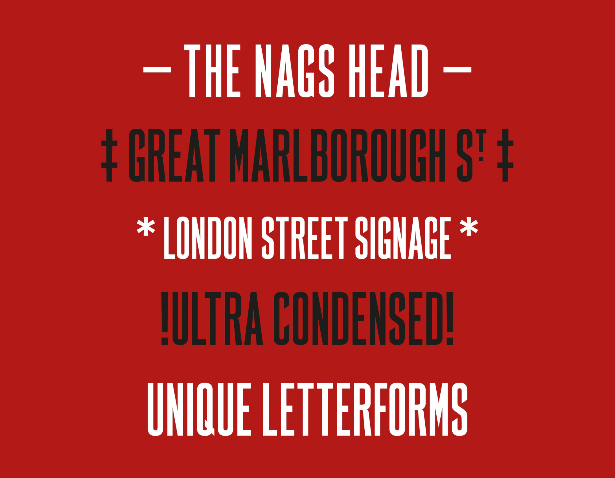
First up, how about FS Marlborough designed by Fontsmith (now part of Monotype), a typeface inspired by a set of milk-glass signs in Soho?
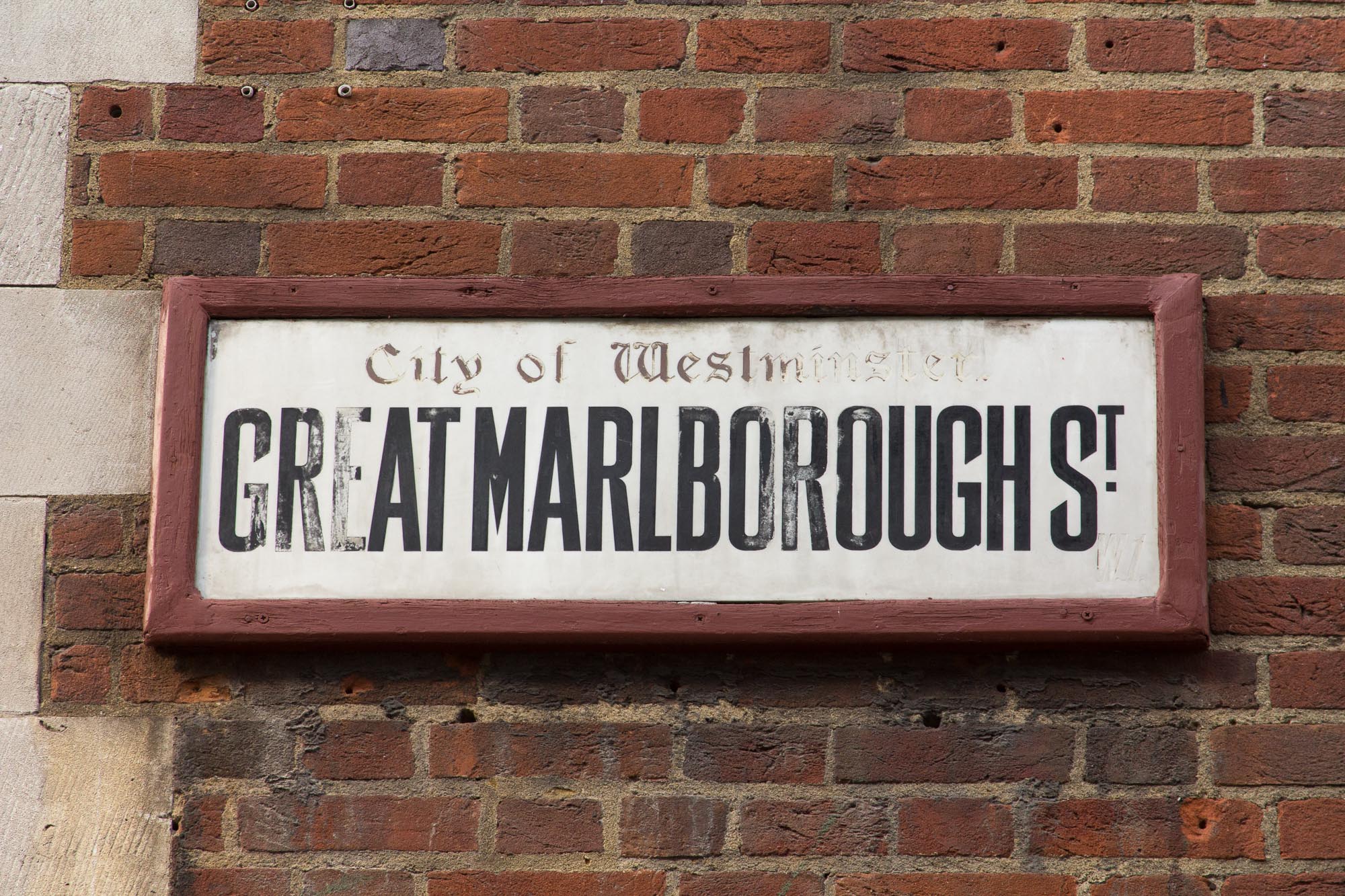
Sticking with letterforms with angled terminals (see the C, G and S in the sample above), there are a few other fonts with a similar feel. There’s Enamela from K-Type, based on various forms of enamel signage, including street nameplates, which comes in standard and condensed forms, with three weights of each.

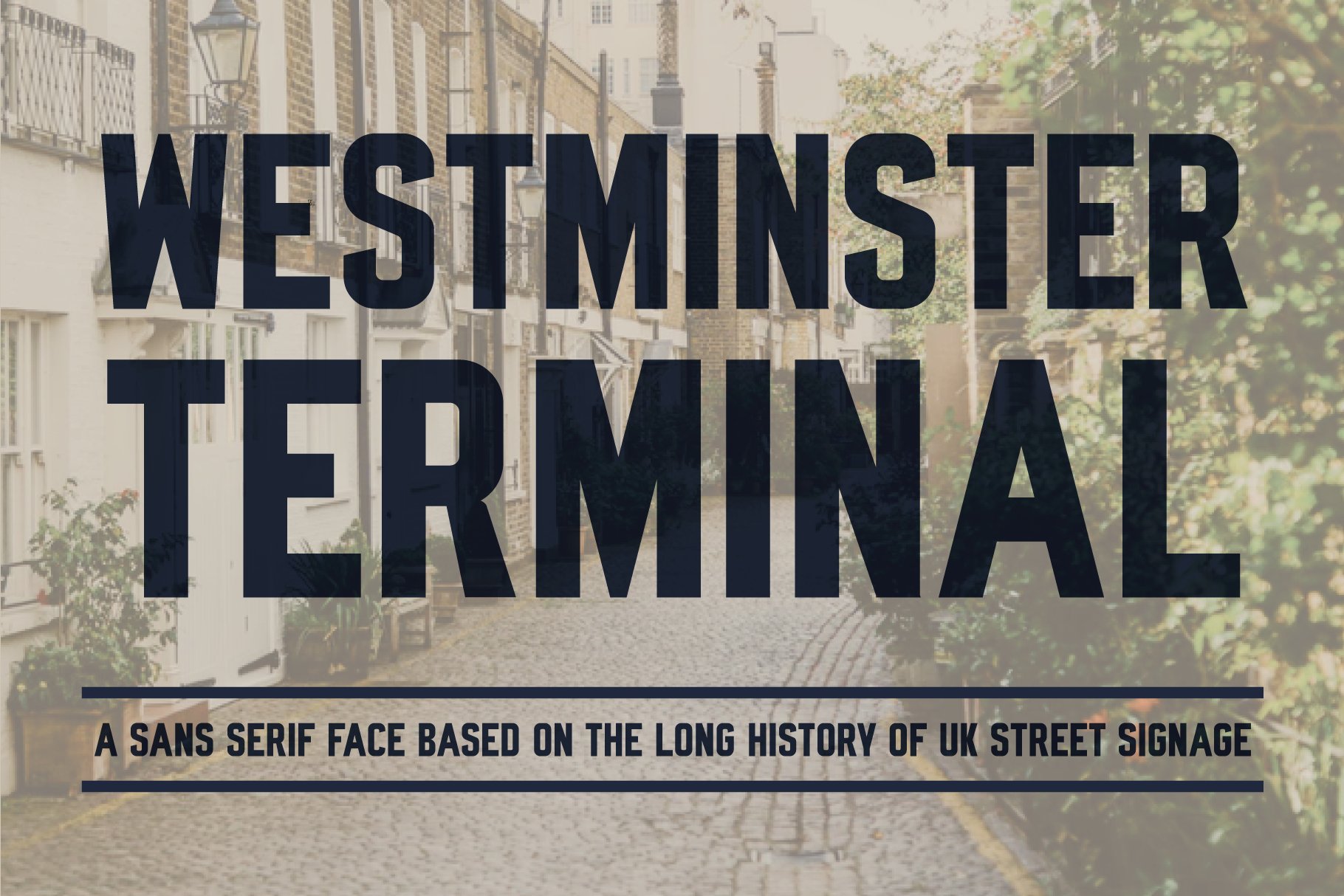
You could also try Westminster Terminal:
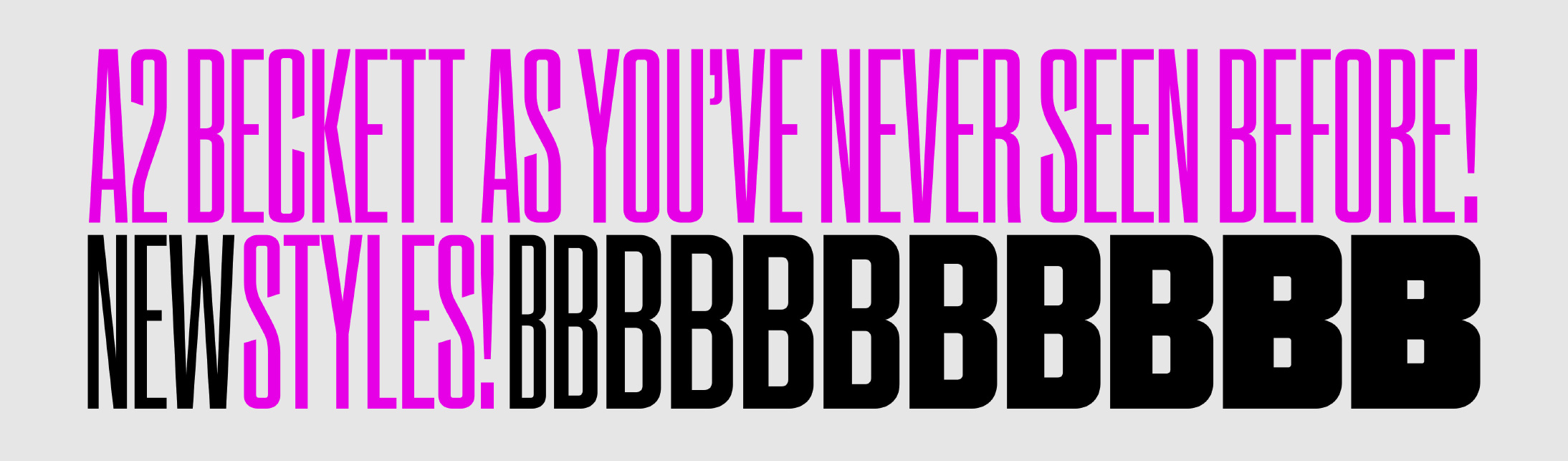
or perhaps Beckett from A2Type:
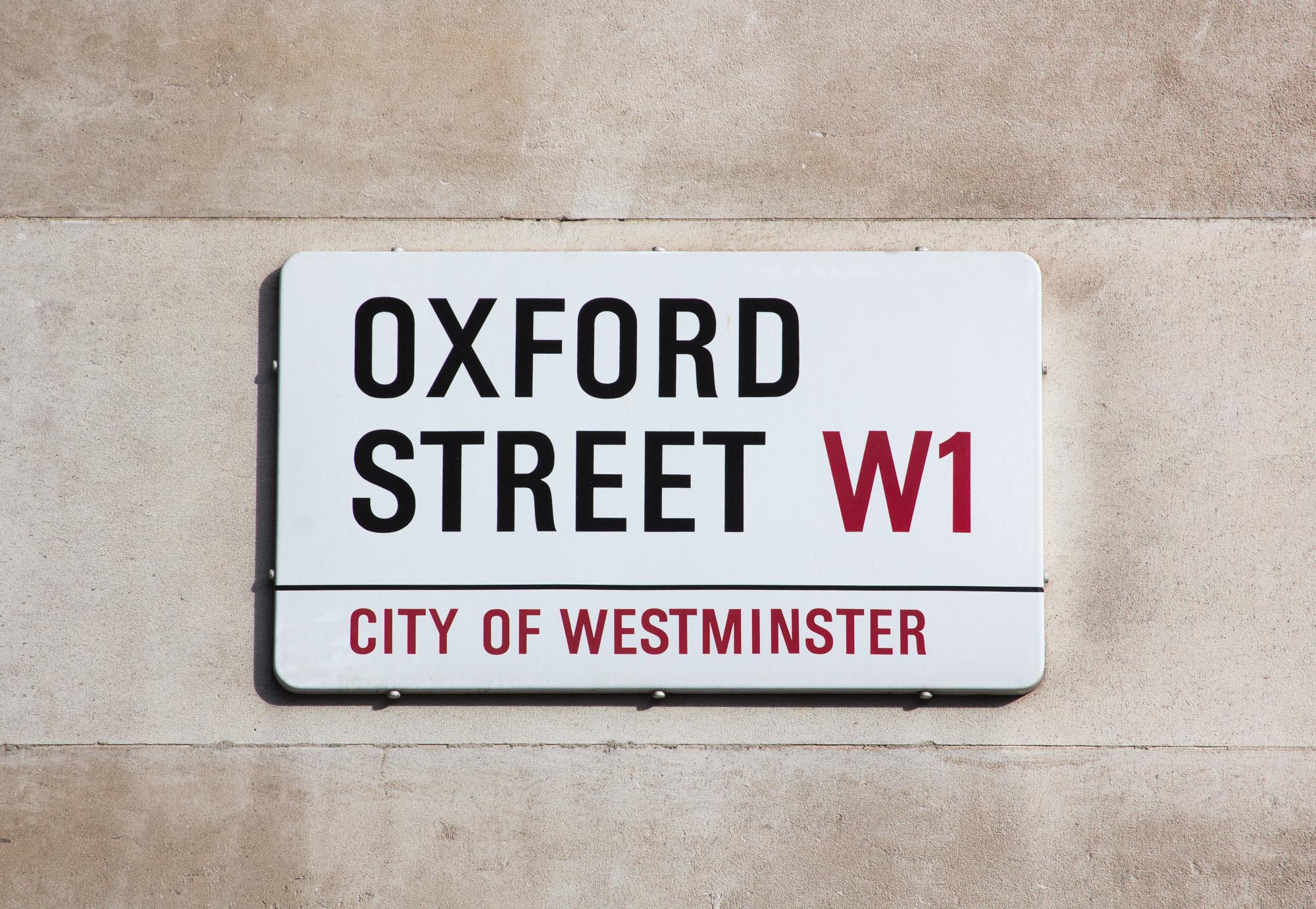
And if you were interested in replicating the City of Westminster nameplates, with their bespoke block letter alphabet, you could turn again to K-Type, and the Oxford Street font.
THE FUTURE
Street nameplates are a form of lettering design that is ever-present in our lives – simply step outside your door, and you’re likely to encounter more than a few examples. They are a showcase of fascinating typographic history (did I mention my book?), and they have inspired some wonderful fonts.
Yet their design seems to have been allowed to drift away from something careful, beautiful and considered, toward something perfunctory and unloved. And that lack of love echos out into the area surrounding each sign, as if each one not only tells you the name of the road, but also tells you that it’s not really cared for.
We have a wealth of incredibly talented designers and type designers in the UK, wouldn’t it make sense for councils to commission new designs for street name lettering from them? To create new bespoke fonts for their street nameplates – nurturing local talent, and creating a sense of local pride. Just take a look at what design studio Atelier Works did with Albertus in Lambeth.