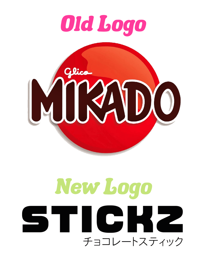
Re-Brand: Mikado Chocolate Sticks

Kira G. Schneider


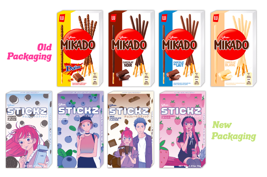
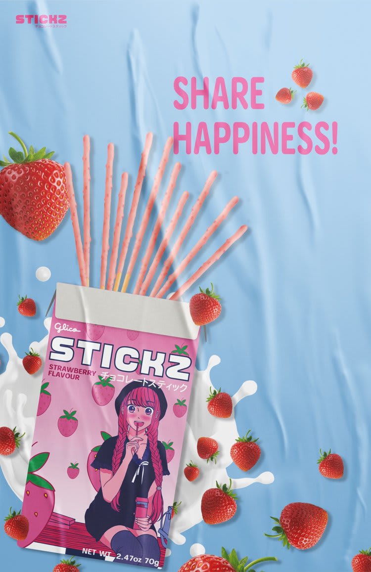
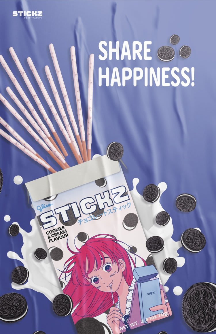
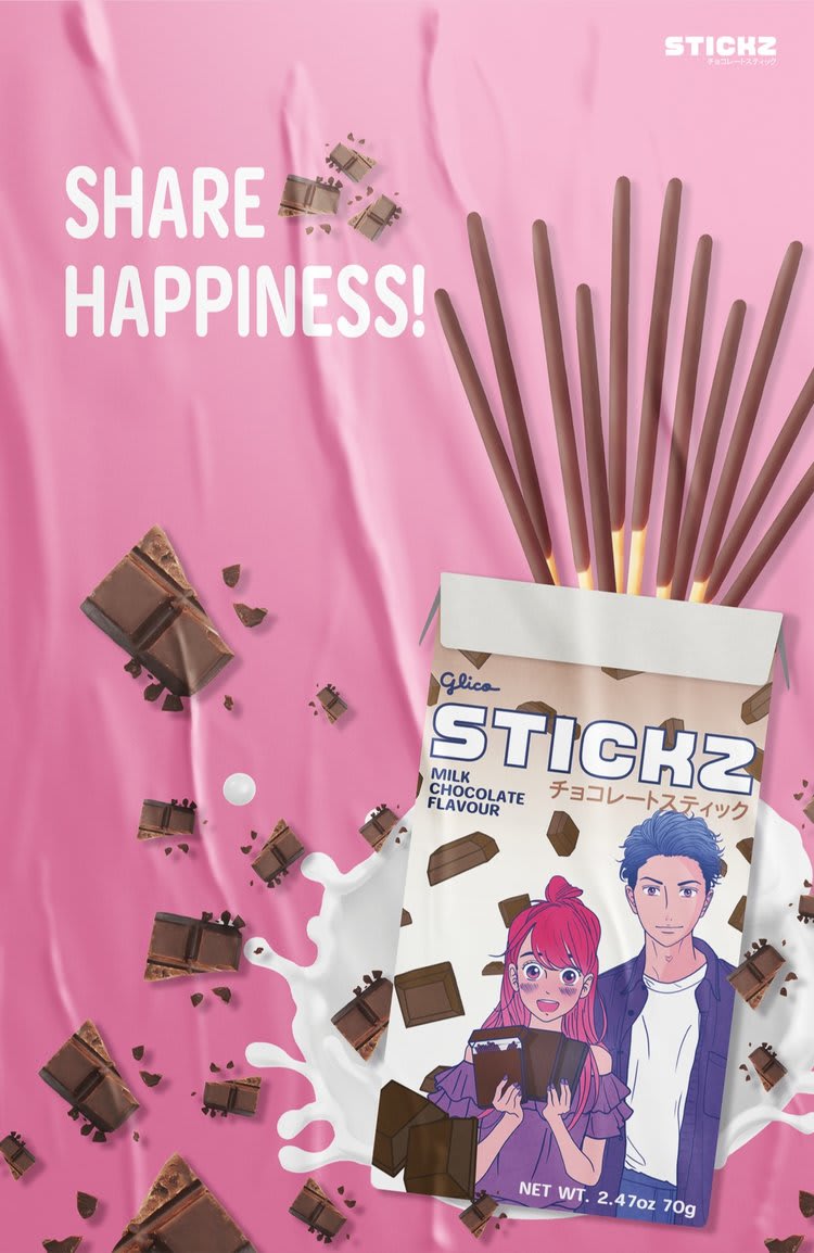
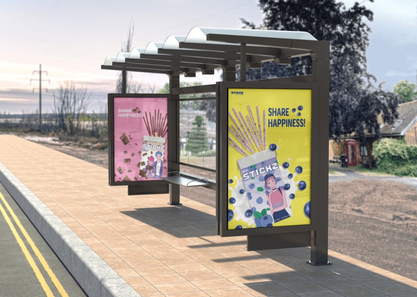
Mikado is the European version of Pocky, a bread stick covered or more specifically dipped in different coloured and flavoured chocolate. Meanwhile, Pocky's branding is keeping up with trends and are more colourful, Mikado's branding is generic with it's current colour palette. Their advertisements are outdated and targeting adults, than the younger generations (6-10 year olds) who could be more of a potential target audience. These are the main points why I decided to re-brand this product and create something new but inspired by its roots, the Japanese culture!
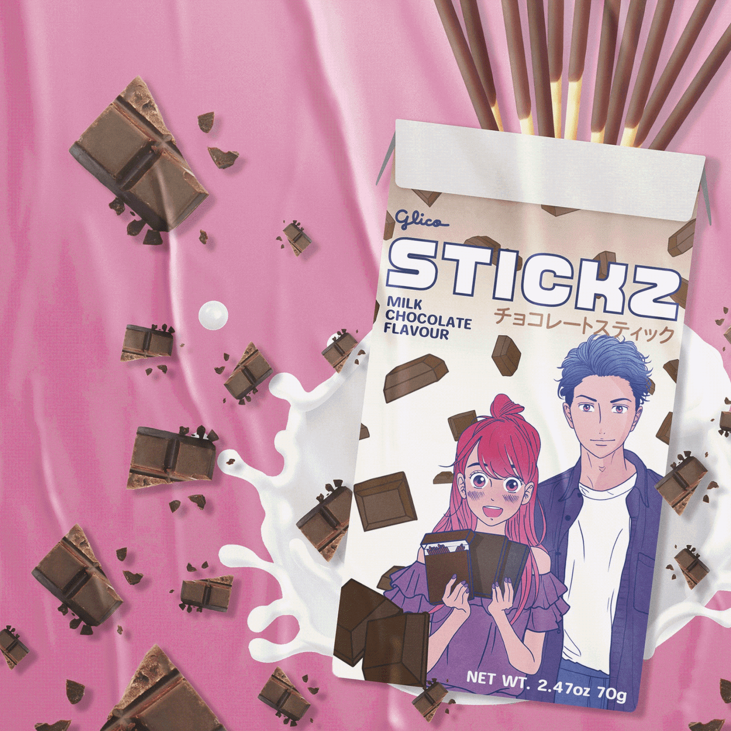
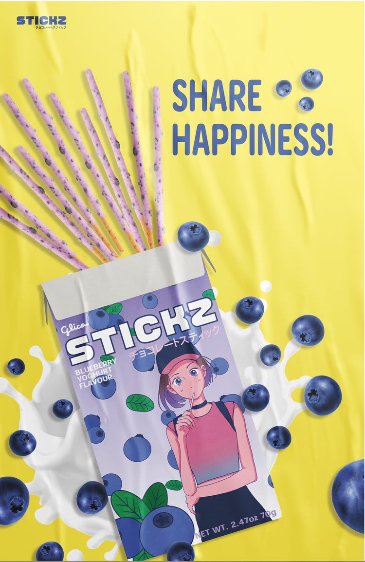
Instead of keeping the word mark Mikado, I changed it to Stickz as younger generations may not be familiar with the word and its origins. Since one of the bonus requirements in the brief was to keep the aesthetics modern but retro, I ended up using and experimenting and added added ‘chocolate stick’ in Japanese kanji under the main logo. For other visuals, I illustrated characters to make each flavour design unique. The overall layout also reminded me of Japanese magazines and the elements mentioned above, brand visually appealing.
Click this link to view more: https://www.gerdakira.co.uk/portfolio/mikado-rebrand