The Finder
Here's what I had to say about the Mac OS X Finder two years ago.
Over the years, the Mac OS X Finder has gained a well-deserved reputation as the least pleasing bundled Mac OS X application. [...] While some people like it, few love it, and many hate it.
To a casual observer, this might appear a bit extreme. The Mac OS X Finder seems, if not glamorous, then at least benign. What's the big deal? The bad feelings about the Finder don't spring from a single source. There are at least three distinct threads of Finder dissatisfaction, usually appearing in combinations of two or more in any given Finder malcontent.
I went on to describe those three threads of dissatisfaction: spatial/browser-mode interaction, performance, and "the little things." That summary is still worth reading; all three pillars of Finder angst remain relevant in Leopard.
They're relevant partly because the Leopard Finder makes an effort to address each one directly. "Address" does not mean "resolve," however. But first, some good news.
Performance
The Leopard Finder seems to have finally sorted out how to deal with most network resources without locking up its entire user interface. I know there have been false alarms about this in the past, but I think Apple really did it this time.
Case in point: iDisk. Even when .Mac is extremely slow to respond, the iDisk window appears instantly. Granted, the window may be empty for some time as the Finder waits for .Mac to send data, but the important point is that control is immediately returned to the user. Put that iDisk window aside and come back to it later when it's finished loading; you can continue your work elsewhere. Ah, blessed sanity.
This applies to local folders too. I can open a folder with over 10,000 items in it and then immediately switch to another Finder window and do something else while it loads. But I shouldn't really bother because it'll load in only a second or two. Scrolling through 10,000 items still has a few hiccups, but it seems mostly i/o bound now, as it should be. The dreaded beach ball never appears during this exercise.
Problems still lurk, however. For example, connecting via FTP (sorry, still read-only), putting the server to sleep, then attempting to open a folder on the server will sometimes result in some quality beach ball time. The timeout seems reduced from Tiger, however. The "Server connection interrupted" dialog appears in about fifteen seconds.
Other times, it works just like the iDisk case: a new window appears with a spinning progress indicator in its status bar, and control returns to the user immediately. I don't know why the beach ball appears so sporadically, but it's still a refreshing change from the days when it was omnipresent.
Disk i/o in general feels snappier in the Leopard Finder. The most prominent example is how quickly icon previews are generated. Perhaps it's not so much that they're generated quickly, but that the task is accomplished with so little fuss. The disk ticks, the generic icons are replaced with previews, and all the while the Finder remains responsive to other actions.
Overall, I have to say this is the most significant performance improvement in the history of the Mac OS X Finder. There's still more work to be done on the dark corners of network connectivity, but the underlying issues seem to have been addressed.
The little things
The Leopard Finder goes a long way towards fixing all those niggling little issues that have been driving people nuts for years. In fact, several of my own personal peeves have been addressed. Keep this positive outlook in mind as I embark on one last rant about how long this has all taken.
I'll start with two screenshots (highlights added).
 |
|
It's hard for me not to use profanity at this point, so thoroughly do these two additions infuriate me. On the one hand, I've been wishing, hoping, and sometimes begging for these features for years, and I'm glad to finally see them in Leopard. But on the other hand, actually using these features and experiencing how much more pleasant they make my daily life on the Mac—as I knew they would—only reminds me of how stubbornly Apple refused to add them for the past six years!
Oh, the agony inflicted for want of such simple features! In the case of the icon grid spacing adjustment, this is something that existed in a lesser form (only two settings: tight and wide) in classic Mac OS and was dropped during the transition to Mac OS X, like so many other features, without explanation or justification. Worse, the spacing between icons was expanded to a comical size in Mac OS X 10.0 and never recovered. It always seemed to me to be some sort of punishment for daring to use icon view. Just look at this screenshot from Tiger showing the Applications folder with 48x48 pixel icons, scaled to 50 percent of its original size.
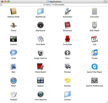
Icon view in Tiger
Apparently the super-secret technology that enables adjustable grid spacing has finally been rediscovered at Apple, presumably in a huge warehouse filled with identical-looking crates of classic Mac OS technology. Here's a screenshot of the same folder with the same 48x48 icons, scaled to the same 50 percent of its original size, when viewed with sane icon spacing in Leopard.
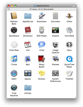
No names are truncated, every single icon is visible, and the window uses about half the number of pixels. Amazing, this modern world we live in.
As for the warning when changing file name extensions, it's a reasonable thing to do in a system where (unfortunately) file name mangling is the official way to encode file type metadata. It's the inability to disable the warning that's so obnoxious. Again, the changes required to do this are not complicated. Why did it take so long?
I'm sure the words "limited resources" and "priorities" would appear in any explanation Apple would give (as if they'd ever give one, ha), but ironically, I think that misses the bigger picture. What we have here is a textbook case of priority inversion: two seemingly insignificant features held back for years, unnecessarily fomenting ill will by needling users on a daily basis, effectively blocking the higher priority task of making a Mac OS X Finder that everyone can enjoy using—or, put less charitably, that fewer people loathe.
Obviously, everyone's pet features can't be added, but at a certain point the ratio of "ease of implementation" to "annoyance caused by their absence" tips over in favor of features like this. There were already enough legitimate reasons for people to hate the Finder. Leaving little annoyances like this around for so long was just rubbing salt into the wounds.
Okay, rant over. Adjustable grid spacing and the ability to silence file renaming warnings are finally here in Leopard. These tiny features will make a disproportionately huge improvement in the lives of many thousands, perhaps millions of users. Apple gets full credit for recognizing the worst offenders and fixing them. The fact that it took so long is a shame, but much better late than never.
New views
The new Finder also has some interesting new features. We'll start with the visual.
The Leopard window look suits the Finder well, blessedly excising the fat borders of its metal ancestors. On the down side, the browser sidebar has adopted the iTunes look, with the obnoxious ALL CAPS headings and custom highlight style.
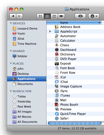
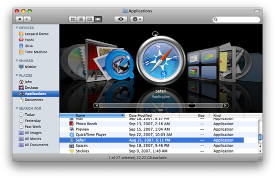
As you can see above, list view items now have alternating background colors—a welcome change. Cover Flow continues its march through Apple's product line, now appearing in the Finder as well as iTunes, iPhone, and iPod.
Smart folders get a place in the sidebar, with the default set shown above. As usual, a good selection of defaults goes a long way towards making a feature more useful. Even for people who have no idea what a smart folder is, the Today, Yesterday, and Past Week items are immediately understandable and useful.
By default, any smart folder created will initially appear in the sidebar. Drag it off and watch it go poof. Drag it back on and it can go in either the PLACES or SEARCH FOR sections (so obnoxious... ). Smart folders remain plain XML files that are simply treated specially by the Finder.
Finally, icon previews get even more aggressive in Leopard. The Finder goes to great lengths to provide previews for even the most mundane and inscrutable of file types.
The squinty text seems kind of silly, but believe it or not, you can actually make out the basic structure of the document (well, the first page, anyway) even at icon sizes smaller than those shown above. And as you'll soon see, a quick preview of the file's contents is only a keystroke away.
Quick Look
The new Quick Look feature, denoted by the stylized eye icon in the toolbar, provides a surprisingly fast and rich preview of file contents. Its keyboard shortcut is particularly convenient. Just select any file and hit the space bar to see a preview. Here's an example.
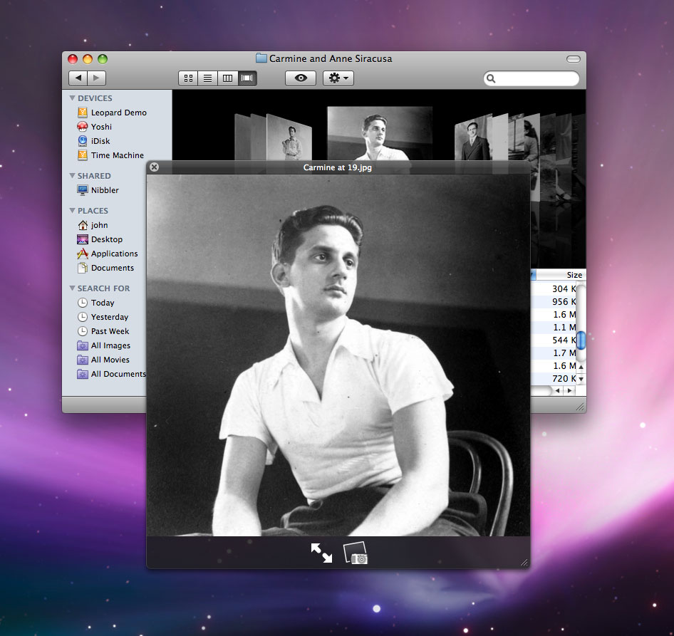
Most of the time, the black-tinted Quick Look pane pops up instantly. This responsiveness makes the feature much more likely to be used. The speed extends even to more complex document types, such as PDFs, in which the "preview" isn't far removed from actually opening the file.
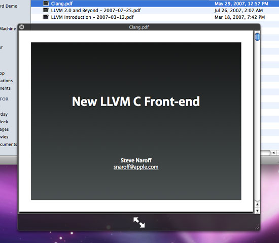
That's a resizable, page-able view of the entire PDF. The dual arrows at the bottom expand it to full-screen, providing a nice way to do a quick presentation.
Quick Look has a plug-in architecture similar to Spotlight. Developers must create plug-ins that can read their own proprietary document types and generate previews. Leopard ships with plug-ins for most standard file formats.
Spotlight
Spotlight's crazy orphan search windows are gone in Leopard, leaving only its incarnation in the Finder—and a greatly improved incarnation, at that. Check it out.
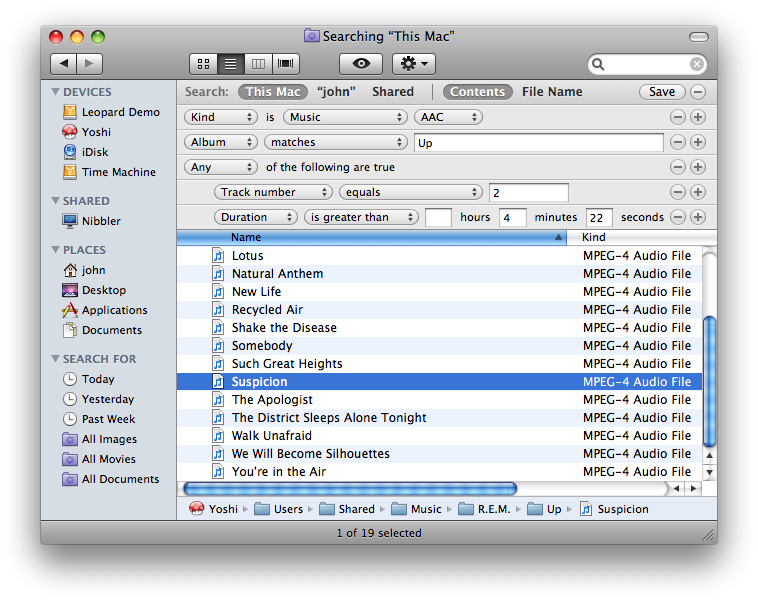
Spotlight search: nested boolean logic!
Yes, that's right, nested boolean logic is finally supported! Just option-click on one of the circular "+" widgets to create a new nested clause. Combined with the aforementioned rewrite of the Spotlight indexing system, the new file search interface is now what it should have been all along: powerful, understandable, and fast.
Access control lists
Access control lists, introduced in Tiger but disabled by default, are now enabled by default in Leopard. The Finder's "Get Info" window includes a new pane for adjusting them.
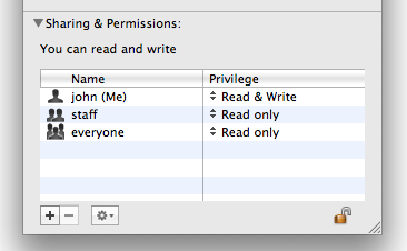
Changes made to this pane that fall within the realm of standard Unix permissions are handled as such. Any rules that go beyond that will trigger the creation of an ACL. It's a nice unified GUI for concepts that are only separate internally for historical reasons.
(Note that the GUI provides only the basic options: read only, write only, and read/write. You still have to resort to the chmod command for more fine-grained control.)
Screen sharing
Leopard has extensive support for screen sharing—that is, the ability to see another computer's screen in a window on your Mac and (optionally) control that computer with your mouse and keyboard—using the VNC standard as well as Apple's own Remote Desktop protocol. Both the client and server are included in Leopard, and the Finder is the gateway to the client. Browsing a networked computer that has a server for one of the supported protocols enabled will reveal a "Share Screen" button.
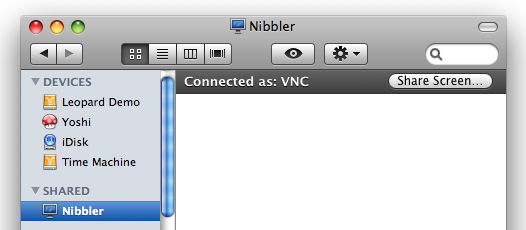
Clicking it will launch the Screen Sharing application which is surprisingly capable, including many features absent from the pre-Leopard versions of the commercial Apple Remote Desktop product. In particular, scaling and adaptive quality control make this client noticeably faster.
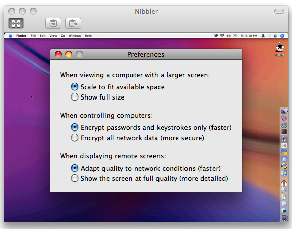
In the screenshot above, I've scaled the remote computer (a Mac running Tiger and Apple Remote Desktop) to an extreme degree, but it's still fully functional and surprisingly usable even at this tiny size. The preferences dialog in the front belongs to the Screen Sharing application, as does the toolbar with handy "Send to/from Clipboard" buttons on it.
The Screen Sharing application is hidden in /System/Library/CoreServices, but can be launched manually and used to connect to another computer if you know the IP address. You'll be prompted for a username and password, with the option to explicitly request permission to share the screen.
(Screen sharing is also built into iChat, though it appears to require both participants to be running Leopard. URLs in the form vnc://... will also work in the Finder.)
If you are your family's "Mac guy," the newfound ubiquitousness of screen sharing alone is reason enough to get everyone to upgrade to Leopard.
An application divided against itself
The Finder still can't quite decide what it wants to be when it grows up, a file browser or a spatial file manager. A clean separation of concerns would allow it to be both, but this is a solution that Apple has thus far avoided.
In Leopard, the two window types remain: the sidebar/toolbar-sporting "browser" window style, and the style that lacks both the sidebar and toolbar. Opening a folder from within a browser-style Finder window replaces the contents of that window, whereas the same action in a non-browser window causes a new window to be opened.
The latter style is often called "spatial" because the creation of a new window for each folder is a prominent behavior of the classic Mac OS Finder and other file browsers that link spatial window state (size, position, etc.) to individual folders. But there's more to being a spatial file manager than opening a new window for each folder. The basic requirements for a spatial file manager are:
- Each folder is represented by a single window.
- Each window is unambiguously and irrevocably tied to a particular folder.
- All changes to the spatial state of a window are preserved (e.g. size, position, color, view style, etc.)
Sorry for the review, but it's been a few years since I've covered this ground. I'm not, however, going to present an argument in favor of spatial file management in this review. (I wrote one four years ago, if you're interested.) I'm just trying to define the terms of the debate.
Historically, the Mac OS X Finder has not fulfilled the requirements described above and therefore could not be considered to have a proper "spatial mode." In particular, requirement number two is violated ten ways to Sunday by the oblong toolbar button that transforms any Finder window into a browser (i.e., a portal through which the contents of any folder can be viewed).
Of course, the mere presence of this ability isn't the same thing as it actually happening. For a simulated spatial Finder, why can't a user simply choose not to transform Finder windows in this way? The converse goes for those that want a purely browser-style Finder.
Sadly, working around the Finder's identity crisis has not been so easy. In all past releases of the Mac OS X Finder, it was impossible to work with one kind of window without the other kind popping up in your face periodically, unrequested and unwanted. This annoyed browser and spatial aficionados alike.
Upon first using the Leopard Finder, you will be forgiven for thinking that things are looking up on the spatial/browser front. Windows are much less likely to sprout (or un-sprout) sidebars and toolbars without being explicitly asked to do so. Sure, new folders created on the desktop still seem to unconditionally open in browser mode, but overall there's been an improvement over past releases.
Unfortunately, things are much more grim than they first appear for fans of spatial file management—or anyone else that cares about view style retention in the Finder.
The Leopard Finder makes its usual, halfhearted, buggy attempt to retain window size and position for each folder. It still does so using .DS_Store files in each directory, and those files are still written in an undocumented binary format. What the Leopard Finder no longer even attempts to do, however, is remember the view style for each folder (e.g., list view, icon view) unless explicitly asked to do so by the user. Here are the steps required to do that.
- Open the folder.
- Set its view style to the desired state.
- Open the View Options panel (type command-j or select the item in the View menu).
- Check the "Always open in ... " checkbox, where "... " will be the view style set in step 2.
This process must be repeated for every single folder that you want to retain its view style. If you do not do this, the view style of any given folder will be the same as the last view style that you explicitly selected for any folder.
In other words, while window size and position remain attributes of individual folders, view style is now a global attribute of the Finder application itself (optionally overridden by a per-folder setting that must be manually applied as described above). Here's a demonstration.
Note how Folder B's view style appears to mimic the view style set for Folder A. What's really happening is that the global Finder view style setting is being changed. Changing the view style anywhere—whether it's in Folder A, Folder B, or somewhere else—determines the view style that every newly opened Finder window will use. The only exceptions are those folders that have had their view styles manually pinned to a particular value using the "Always open in ... " checkbox.
And by the way, checking that checkbox does not mean that future changes to the view style of that folder will be retained. If you want to retain a view style change to such a folder, you must do the following.
- Open the folder.
- Set its view style to the desired state.
- Open the View Options panel.
- Uncheck the "Always open in ... " checkbox, where "... " will be the view style as it appeared in step 1.
- Check the "Always open in ... " checkbox, where "... " will now be the style set in step 2.
Again, repeat this process for every every single folder that you want to retain the new view style that you've set for it.
This avalanche of mandatory explicit action effectively represents a denial of service attack on the spatial style of file management. It overloads the user with a never-ending stream of mundane tasks, making the formerly transparent process of view style retention so inefficient that it will likely be abandoned entirely.
If the Mac OS X Finder wants to be a pure browser, then fine, go for it. But in a proper browser, all view state—not just view style—is rightfully an attribute of the browser itself rather than the thing being viewed. For example, when opening a URL in Safari, the Safari application determines the size, position, and adornment (toolbars, etc.) of the resulting window, not the web site being viewed.
So why has the Leopard Finder chosen to make view style alone an attribute of the application, leaving window size and position as implicitly belonging to each folder? Why the continued charade of the two different window styles? Hell, what explains the continued existence of the global "Always open folders in a new window" preference that effectively stops any window from being a proper browser?
The Finder remains a truly conflicted application. On the one hand, the balance has shifted heavily in favor of browser-style file management in Leopard. On the other hand, many features related to spatial file management remain. It's a mess, and shifting the mess to one side or the other is not going to help much. It's particularly painful to watch Apple continue to flounder in this area when there's a blindingly obvious solution.
Of course, Apple could go all-browser or all-spatial, but presumably neither of those extremes is attractive or we'd have seen one already. No, the Finder has to do both. I've often gone into great detail about the particulars of such a Finder, but apparently there's too much nuance in that approach. Let me say it more plainly: for the love of God, Apple, just freaking separate the two modes! Let each be true to itself, free to flourish and expand in the appropriate ways. I can boil it down to three bullet points.
- Two window styles: browser and spatial.
- No ability to transform a window from one style to another.
- The "New Finder Window" command becomes "New Browser Window."
Then just make the browser and spatial windows behave according to the rules of their respective well-established conventions. That's it! Oh, sure, there are details to be sorted out, like, say, coming up with a reliable, efficient, user-specific mechanism for storing view state information, eliminating the scourge of .DS_Store files. But these are details; get the two modes sorted and everything else will fall into place eventually.
The Finder on the couch
I first noticed the new view style behavior in Leopard when I logged in one day and saw that all my open Finder windows had reverted to icon view. That's obviously a bug, I thought, and I filed one with Apple. As I investigated further and came to understand the underlying cause, I replaced the previous bug with a new one that reported the strange "global view state" phenomenon. Needless to say, the bug was closed with the status "Behaves Correctly."
Uncharacteristically for Apple, a brief explanation of the rationale for the change accompanied the closure. The boilerplate-esque text said, in part, "To appeal to most users, the view style mechanism has changed in Leopard. [... ] To view all folders in your favorite view style you need only click on the view style button once, and you will remain in that view style."
Rarely are we given any insight into Apple's reasoning when it comes to user interface changes, so I'm inclined to mine this tiny nugget for all its worth. It seems clear to me that the new behavior is intended to satisfy a demand for more browser-like behavior, something that "most users" have told Apple they want. I don't find that surprising; ever since the sidebar appeared, the Finder has certainly looked the part of a browser. Its behavior, however, has remained schizophrenic. The common user response: "It looks like a browser, but doesn't behave like one. Please correct this."
On the other hand, apparently some people at Apple believe that going to a full-on browser would be too much. Perhaps they fear it will result in a flood of complaints about "windows not remembering their settings."
This is the type of feedback you can expect from regular users: expressions of particular pain points. It's not their job to solve the Finder's problems or even to understand the underlying causes. But being reactive to this kind of feedback at this level of granularity will only lead to feature churn.
And so you get changes like those made to the Leopard Finder. A change here to address a situation where the Finder isn't browser-like enough, implemented in such a way that it (further) breaks spatial mode. Oops, now let's throw in an "Always open in ... " view option to make those other people happy. And round and round it goes. Push something in over here, something else pops out over there. No one is thinking about the big picture.
As a sop for spatial file management fans, the "Always open in ... " view option fails spectacularly. It's more like a giant middle finger from Apple. At the very least, an option to restore the pre-Leopard behavior of automatically retaining view style on a per-folder basis (radar 5543643) is necessary to restore some semblance of balance. But in the long run, it's all futile unless the larger issues are addressed.
Finder summary
The Finder was one of the biggest surprises for me in Leopard. It was not apparent at all from the brief Leopard Finder demos shown at the various Macworld Expo and WWDC keynotes that such significant changes had been made. Certainly, there's wasn't even a whiff of the new policy on view style retention.
After many years of bugs, poor performance, a feeble browser, and a pseudo-spatial mode, it'll be interesting to see what kind of reaction this change gets in the wider Mac community. You don't need to know or care about any of the high-concept user interface theories to get annoyed when the results of your actions are not respected enough to be preserved. On the other hand, the Finder has been flaky about state preservation for years. How many Mac users have simply given up trying to make the Finder a familiar, hospitable place? Maybe no one will even notice that view style changes are no longer preserved automatically.
Well I sure as hell noticed, and it pisses me off. I'll be gritting my teeth as I wander my hard drives, manually pinning down the view style of each folder I care about. I'll grimace every time I naively change a view style only to be surprised later when I realize that my change was ignored because I forgot to (re)pin it manually. I'll curse as I spend time and energy finding a way to automate the entire tedious process. (I've gotten as far as figuring out how to set the "Always open in ... " checkbox using a hex editor on the appropriate .DS_Store file. Sad, but true.)
The Leopard Finder's saving grace may be that the increased responsiveness and new features are likely to overshadow all other issues, and will go a long way towards damping the flames of hatred burning in certain corners of the Mac world (even as the view style changes ignite more).
Way back in 2002, I wrote that "the changes being made to the Mac OS X Finder betray a fundamental lack of vision." This continues to be the case. Not only does the Leopard Finder take no bold steps towards a brave new world of file management, it even further distances itself from a coherent incarnation of established file management paradigms. The changes in Leopard do indicate that Apple has taken a renewed interest in improving the Finder, but motion is not the same thing as progress. For where I'm sitting, it looks like one step forward, two steps back.
reader comments